Below, you can step back into this decade, when the distinctiveness of 1950s home decor was impossible to ignore. As bold as Elvis‘s hip swivels and as iconic as Marilyn Monroe‘s blonde curls, 1950s style certainly left a memorable trace in interior design history.

1950s decor in the living room
Shall we begin with the living room? Picture neatly tailored furniture — sofas and chairs in exciting, inviting shades, often featuring vibrant patterns. From floral prints to geometric shapes, these designs reflected the optimism of the post-war era.

1950s home decor embraced a playful mix of textures and colors. Many times, floors boasted wall-to-wall carpeting or linoleum, often in bold, striking contemporary patterns.
Wallpaper was a popular choice for adding visual interest, with whimsical designs and bright hues. Florals and patterns were ever popular, but came in more colors and styles than in the decades before.

1950s decor in the kitchen
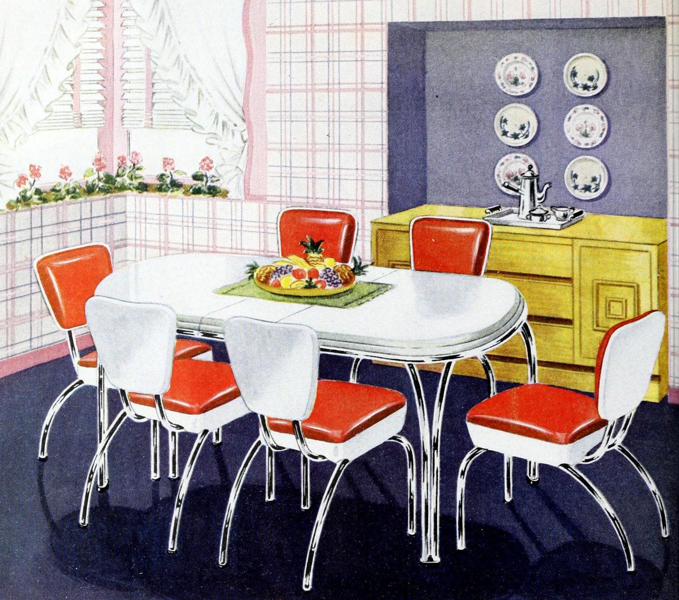
The kitchen was the cornerstone of the 1950s home — and its interior decor showed it. In particular, chrome dinette sets, checkered floors, and metal rimmed tables made these spaces look like they’d been plucked straight from an episode of “I Love Lucy.”

And appliances? Well, this is the decade when they began to become as colorful as a box of crayons! Think refrigerators and stoves in shades like robin’s egg blue, dusky pink, seafoam green, or a sunny yellow.

Speaking of colors, the 1950s paint colors reflected the buoyant spirit of the times. Pastels reigned supreme, from soft pinks to baby blues, mint greens to lilac purples. And don’t forget the bold, primary hues! Their popularity was a stark contrast to the somber, muted tones of the war years, and a reflection of the era’s overall exuberance and optimism.

Eat-in kitchens with Formica-topped tables were as ubiquitous in the ’50s as smartphones are today.

1950s decor in the bathroom
Take a detour into the bathrooms of the 1950s, and it’s like stepping into a time capsule of style. It’s the era of pink bathrooms, thanks to First Lady Mamie Eisenhower’s love for this rosy hue. Pastel-colored sinks, bathtubs, and toilets in shades of pink, blue, or green were all the rage. (And PS: they’re coming back!)

Now, imagine those alongside ceramic tiles — often in contrasting or complementary shades. And who could overlook the iconic checkered tiles? From the floor to the walls, bold patterns, contrasts and bright colors made these small spaces burst with personality.
Even the fixtures offered an opportunity to dazzle — with shiny chrome taps and towel racks offering a slick contrast to the vibrant ceramics. It’s fair to say, in the 1950s, even bathrooms weren’t immune to the decade’s spirited design ethos.
Throughout the home
In the world of 1950s decor, there were few neutral corners. Every surface was an opportunity to make a statement. Curtains, cushions, lampshades — all bore the mark of the era’s unapologetic maximalism. And let’s not forget the famous minimalist sunburst clocks and Sputnik chandeliers — clear nods to the burgeoning Space Age.

The most memorable 1950s home decor was a clear reflection of the times. With its vibrant colors, bold patterns, and adventurous designs, it encapsulated the optimism and buoyancy of the post-war era. Its influence continues to inspire today, proving that good design never goes out of style.
Have a look through this collection of colorful vintage 1950s home decor photos — as well as a set of 16 authentic retro Home & Garden magazine color schemes from 1959.

Colorful vintage 1950s home decor ideas: How to make your house sing with color
American Home – October 1959
Color is everywhere around you. But nowhere is it more exciting or more important than in your home.

The choices open to you are as varied as the rainbow itself… soothingly subtle or bold and bright.
Get ideas for how to get vibrant accents… how to be monochromatic with your favorite color. Ideas to make your whole house sing with color!


Get drama in color harmony
… and come up with a striking room. Choose fabrics, wall and floor coverings in colors that go well together.
Add a dash of the unexpected in an accent color, or use a more intense shade of the room’s base color.


See how often an additional sharp color will pick up a scheme that is done in perfect harmony.
Simple drama is in that little extra — a Bristol-blue vase in an essentially pink and beige room, the emerald green cushion in a setting of blues and grays.
Rooms of neutral backgrounds take on high style when fashion-wise color is used on floor and furniture.
A retro checkered floor in a blue 1950s kitchen

1950s decor: Pink ceiling in a ’50s living room
Pink ceiling takes its color cue from the floor covering, giving warmth to room and lowering the high ceiling. A good way to lift a room’s spirits.

A black and white checkerboard floor defined this contemporary dining area

Sparkle with the blue
Blue room has sparks of many other colors. The woven rug, throw cushions and brighter accessories relieve light blue effect, add more excitement to the setting.

Orange with beige
Warm beige tones present a pleasant background in this contemporary room — but the bright idea is the flash of color in the carpeting and the accents of plaid.

Be generous with color
Let paint or wallpaper create a mood of serenity or excitement in your room. Walls and floor coverings give you the widest opportunity for generous use of color. Give these areas special consideration.

Use colors to change a room’s proportions — light colors make a room larger, dark shades can lower a too-high ceiling, horizontal stripes can widen a narrow room.

Bring out the beauty of your furniture by silhouetting it against paler shades or subdue its imperfections against darker hues.
An interesting color contrast on the walls with paint or wallpaper, or a new shade of floor covering, can make your entire room look brand new without changing any of the furnishings.

Use a single color boldly
Your favorite color, of course. Whether it’s sapphire blue, or brilliant yellow, or lime green, or a subtle shade of pink, violet or pale turquoise, it will serve as a take-off point in your scheme that is distinctively your own.
The trick in featuring a single color is to use it in several lighter and darker shades, and with lots of white as the background. But use it emphatically for the most decorative effect.


Vintage chaise in shades of green

Full-height striped fabric curtains and wallcovering (1958)

Blue and green midcentury modern living room color scheme (1958)

Colorful furniture to use as accents


MORE: 60+ fab 1960s chairs in mod & other oh-so-retro styles
Retro midcentury modern curved aqua couch (1950s)

Vivid blue sofa beds from the 50s

Blue curved sofa dominates this retro room

ALSO SEE: Rattan furniture with blue cushions gave this family room a tropical feel year-round
Bold yellow & green window blinds and room decor from the ’50s

Cozy vintage living room with blue accents
ALSO SEE: We are (surprisingly!) obsessed by the vintage wall paneling in these 58 mid-century rooms

1950s living room with yellow accent chairs

1950s orange upholstered dining chairs wake up an otherwise neutral color scheme

A 1950s multi-colored playroom for kids

Bright orange living room sofa in rural style living room

Orange & yellow floral 1950s child’s bedroom

Yellow & blue bedroom decor from the fifties

Vintage gold yellow bedroom decor

Vintage 50s master bedroom with red decor

A mid-century modern robin’s egg blue kitchen

Pink plays off red in this example of popular 1950s paint colors

Vintage 50s master bedroom with shades of green

Vintage midcentury 50s master bedroom with blue and green soft furnishings
DON’T MISS THIS: Vintage ’50s master bedroom decor: See 50+ examples of retro home style

Mid-century living room with blue sofa and chair on green and blue flooring
ALSO SEE: 100+ fabulous ’50s floors of linoleum & vinyl

Pink and white bedroom with wicker furniture (1959)

1950s decor: Pink sofa and chair play off pink pinstriped wallpaper in a living room from 1959

Blue wall accent panel harmonizes with blue chairs and accessories

A retro pink and blue fifties kitchen
SEE MORE: Retro pink kitchens: 1950s home decor you don’t see much today

Bright red retro kitchen with stainless steel appliances

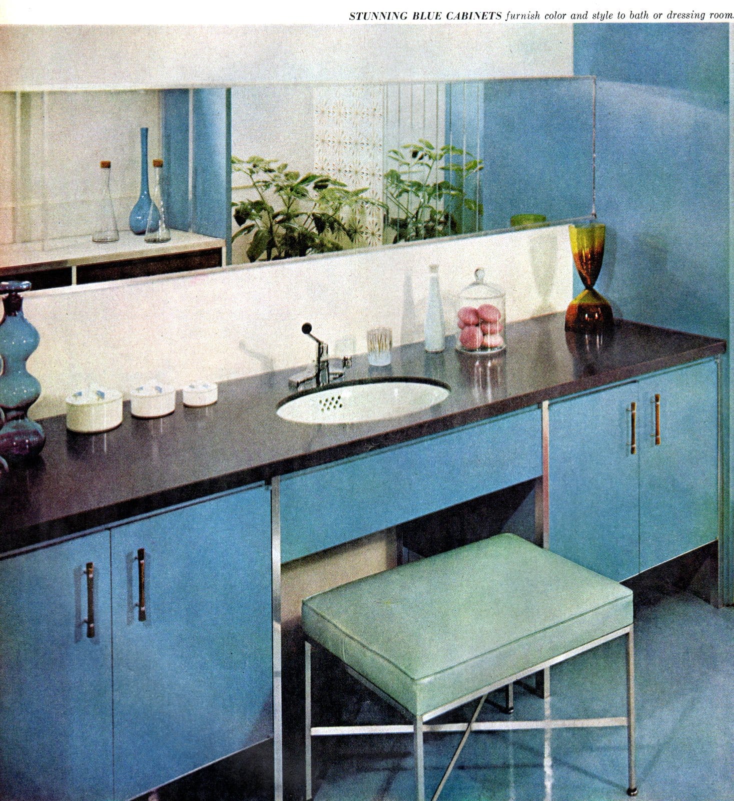
Sleek stylish mid-century modern style blue bathroom
ALSO SEE: 60 vintage ’60s bathrooms: Retro home decorating ideas

Retro blue kitchen design (1958)

Small painted home accents: Decor from the fifties

16 vintage Home & Garden color schemes from the late ’50s
The right colors in the right combinations can be such rich treasure
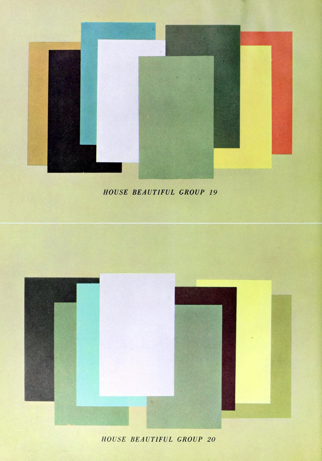
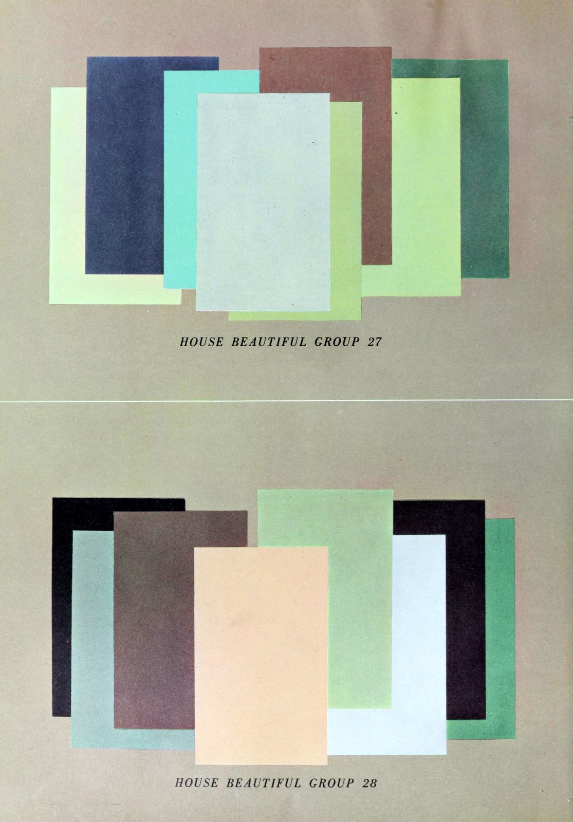
Each of the 16 color groups on the following pages have eight colors arranged on a background color. Out of these 16 sets of nine colors, you can form more than 450 possible color schemes, taking any three contiguous colors as a scheme.

Start with any one color of the nine in any set. Choose as the second any of the colors it touches. As the third and final color in the scheme, use any additional color that touches either of your first two.
Thus, each group will yield from 25 to 30 three-color schemes, which add up to more than 450 possibilities. These color groups continue a series that started with 12 in our issue of January 1958. [Note that the 1959 color panels start with #13.]

Every year House Beautiful puts together for your use the most usable color schemes we know how to assemble.
These color groupings are based on existing merchandise in the marketplace, which we consider to be good now and which we think will continue to be good in the foreseeable future. So you can easily find fabrics, carpets, wallpapers, tiles, and other surfacing materials in these colors.
House Beautiful believes that one color, alone, is next to nothing. So all our work (and talk) is based on the use of colors in combination. When colors are combined, they affect one another in powerful ways.
The best color combinations are those in which each color has a reason for being included, looks better by the company it keeps, and helps to show each other color at its best. This mutual assistance does wonders with the quiet colors and gives unbelievable power to the strong colors.

Expert decorating shows the results of adroit color planning, but it is not easy for most people to separate the color plan from the total decorating plan.
To provide for the translation of color plans to anyone’s own situation, these 1959 House Beautiful color groups are presented in abstract form. The abstract presentation avoids all limitations set up by actual scene illustrations and allows you full freedom of interpretation in use of color in an individual way.
Any color plan may be transposed from one room to another, and in any one room a wide variety of different treatments can be derived from the same colors.
The 1959 House Beautiful color story consists of 16 color groups. These groups present aspects of color which are most appropriate for current fashion in decorating. Each group has eight colors arranged in such a way on a color background that contiguous colors — those that touch one another — show color contrasts that are presently in good taste or good style.

Each group has more than enough colors for any single color plan. A number of rooms may be interrelated in color by continuing through a color series, having one or two neighboring colors common to neighboring rooms.
It is permissible to depart from the background shown and to use one of the other colors of the group as a background, but care should be taken to give preference to the lightest and the quietest colors.
Dark or vivid colors as backgrounds generally call for expert skill in their use. The strength or degree of contrast should be related to the design and purpose of the room.
The House Beautiful color groups include colors commonly available, but shown in combinations that are not common. This will suggest ways to combine still-serviceable items, such as rugs, furniture, drapery, etc., with new furnishings and/or new surroundings such as wallpaper or paint to achieve new contemporary color effects.

The background color is important
The background color is the largest area on each page, and is the key to why the other colors look as they do. It is the “hinge” color around which all the others revolve, so you cannot ignore it. It is “Mr. Big.”
It might be the color of the four walls, or the floor, or the ceiling. No multicolor room scheme would work well without the background color.

The proportion of color area to color area matters
In general, those given the most space on the page are best to use in large areas.

Placement is important
The arrangement of the colors in each scheme is not happenstance or random. The colors that look best together adjoin each other.
Thus you can divide the page, reducing the number of colors to fit your needs, without destroying the balance and pleasantness of the groupings.

The whole is greater than the sum of the parts
How true this is in color! Colors in combination — the right combination — have a character they cannot have alone.
The heart of the 1959 House Beautiful Look in color is combinations — not separate colors set apart. The value of these color groups for your own life lies in the great flexibility they offer you. But they have just enough discipline built into them to keep you from getting too far afield.
They are predicated on freedom of choice, for you will still have to make a number of choices about how to apply these basically sound schemes.

NOW SEE THIS: 130 vintage ’50s house plans used to build millions of mid-century homes we still live in today


4 Responses
I love the lion skin! My dream is to have a leather Chesterfield sofa with a zebra skin on it and a tiger skin on the floor!
No need to kill endangered animals for decor. There are lots of man-made alternatives that look like a zebra skin or leopard. Very stylish, and guilt-free.
Was that necessary?? How would you like it if a stranger criticized your dream items, or anything else you wanted to purchase? What do you eat ? Perhaps you should be criticized for your choices?
Like my parents taught me, “ if you don’t have something nice to say, say nothing “.
You need a lesson in manners.
She didn’t say a real zebra skin, just zebra patterned is what she meant. I understood it.
Lion and tiger skin are both from fabric and easily found. They’re just patterns. Would you criticize if she said real leather. We have alternatives for that, too.
Emelia, enjoy your dreams. They may come true some day!